A density plot is a representation of the distribution of a numeric variable. It is a smoothed version of the histogram and is used in the same kind of situation.
Here is a basic example of a density plot.
# Libraries
library(ggplot2)

# Dataset
set.seed(14012021)
x <- rnorm(200, mean=4)
df <- data.frame(x)

# Density curve in ggplot2
p <- ggplot(df, aes(x=x)) +
  geom_density()
p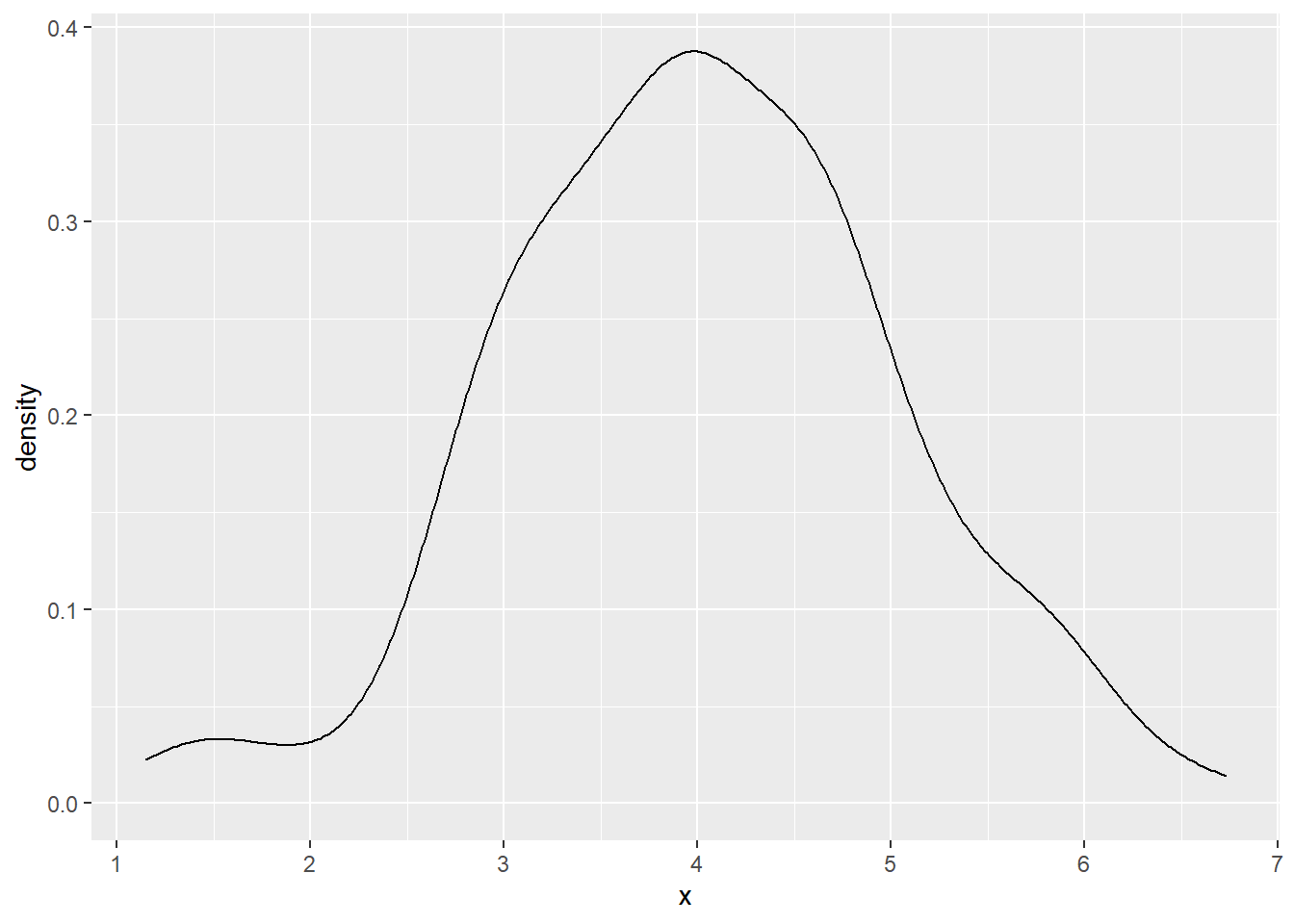
Contact
This document is a work by Emma Lafaurie (emma.lafaurie@inserm.fr) for the SBIM (Service de Biostatistique et Information Médicale) at Saint-Louis Hospital in Paris.
Based on the template of Yan Holtz.