A density plot is a representation of the distribution of a numeric variable. It is a smoothed version of the histogram and is used in the same kind of situation.
Here is a basic example of a density plot with some filled area.
Two-tailed filled area
# Libraries
library(data.table)
library(ggplot2)

# Make a distribution
normalDistribution <- data.frame(
  x = seq(-4,4, by = 0.01),
  y = dnorm(seq(-4,4, by = 0.01))
)

criticalValues <- qnorm(c(.025,.975))

shadeNormalTwoTailedLeft <- rbind(c(criticalValues[1],0), subset(normalDistribution, x < criticalValues[1]))

shadeNormalTwoTailedRight <- rbind(c(criticalValues[2],0), subset(normalDistribution, x > criticalValues[2]), c(3,0))

ggplot(normalDistribution, aes(x,y)) +
  geom_line() +
  geom_polygon(data = shadeNormalTwoTailedLeft, aes(x=x, y=y, fill="red")) +
  geom_polygon(data = shadeNormalTwoTailedRight, aes(x=x, y=y, fill="red")) +
  geom_hline(yintercept = 0) +
  theme_classic() +
  geom_segment(aes(x = criticalValues[1], y = 0, xend = criticalValues[1], yend = dnorm(criticalValues[1]))) +
geom_segment(aes(x = criticalValues[2], y = 0, xend = criticalValues[2], yend = dnorm(criticalValues[2]))) 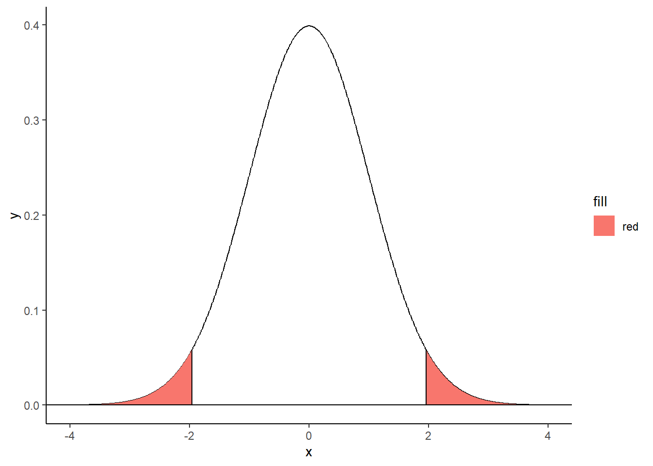
Right-tailed filled area
# Libraries
library(data.table)
library(ggplot2)

# Make a distribution
normalDistribution <- data.frame(
  x = seq(-4,4, by = 0.01),
  y = dnorm(seq(-4,4, by = 0.01))
)

criticalValue <- qnorm(.95)

shadeNormal <- rbind(c(criticalValue,0), subset(normalDistribution, x > criticalValue), c(3,0))

ggplot(normalDistribution, aes(x,y)) +
  geom_line() +
  geom_polygon(data = shadeNormal, aes(x=x, y=y, fill="red")) +
  geom_hline(yintercept = 0) +
  theme_classic() +
geom_segment(aes(x = criticalValue, y = 0, xend = criticalValue, yend = dnorm(criticalValue))) 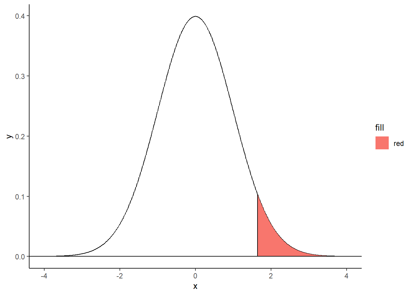
Left-tailed filled area
# Libraries
library(data.table)
library(ggplot2)

# Make a distribution
normalDistribution <- data.frame(
  x = seq(-4,4, by = 0.01),
  y = dnorm(seq(-4,4, by = 0.01))
)

criticalValue <- qnorm(.15)

shadeNormal <- rbind(c(criticalValue,0), subset(normalDistribution, x < criticalValue))

ggplot(normalDistribution, aes(x,y)) +
  geom_polygon(data = shadeNormal, aes(x=x, y=y, fill="red")) +
  geom_line() +
  geom_hline(yintercept = 0) +
  theme_classic() +
geom_segment(aes(x = criticalValue, y = 0, xend = criticalValue, yend = dnorm(criticalValue))) 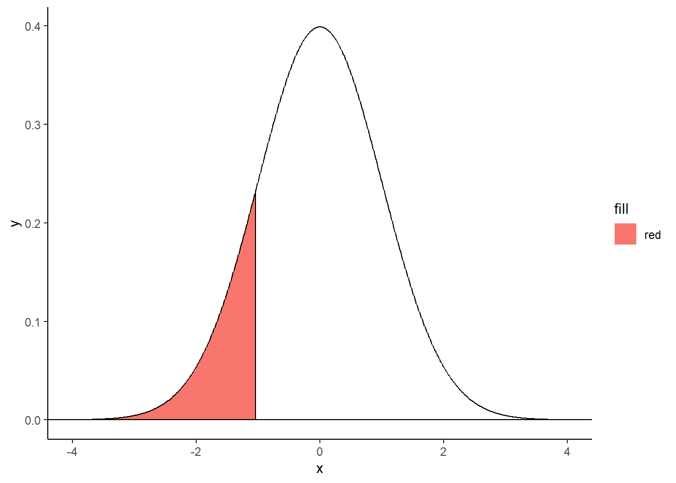
Examples with hatched area and text
x=seq(-5, 5, 0.01)

plot(x, dnorm(x, 0, 1), type="l", ylim=c(0, 0.4), xlab="", ylab="",
     main="Loi normale centrée réduite",
     bty="n",xaxt="n", yaxt="n", lwd=1)
axis(1, pos=0, at=c(-5.5, -1.96, 0, 1.96, 5.5),
     labels=c("", expression(-epsilon[alpha]), 0, expression(epsilon[alpha]), ""),
     tcl=-0.2, cex.axis=1.3)


xx <- seq(qnorm(0.975), 5.5,0.01)
polygon(c(xx, rev(xx)), c(rep(0, length(xx)), rev(dnorm(xx))), density=20, col=2)
xx <- seq(-5.5, qnorm(0.025), 0.01)
polygon(c(xx, rev(xx)), c(rep(0, length(xx)), rev(dnorm(xx))), density=20, col=2)

text(3.3, 0.1, expression("P(Z > " ~ epsilon[alpha] ~ ") = " ~ alpha/2), col="red", cex=1.2)
arrows(3.5,0.08,2.7,0.015,col='red',lwd=1,code=2)

text(-3.3, 0.1, expression("P(Z < " ~ -epsilon[alpha] ~ ") = " ~ alpha/2), col="red", cex=1.2)
arrows(-3.5,0.08,-2.7,0.015,col='red',lwd=1,code=2)

text(0, 0.2, expression(1 - alpha), col="red", cex=1.2)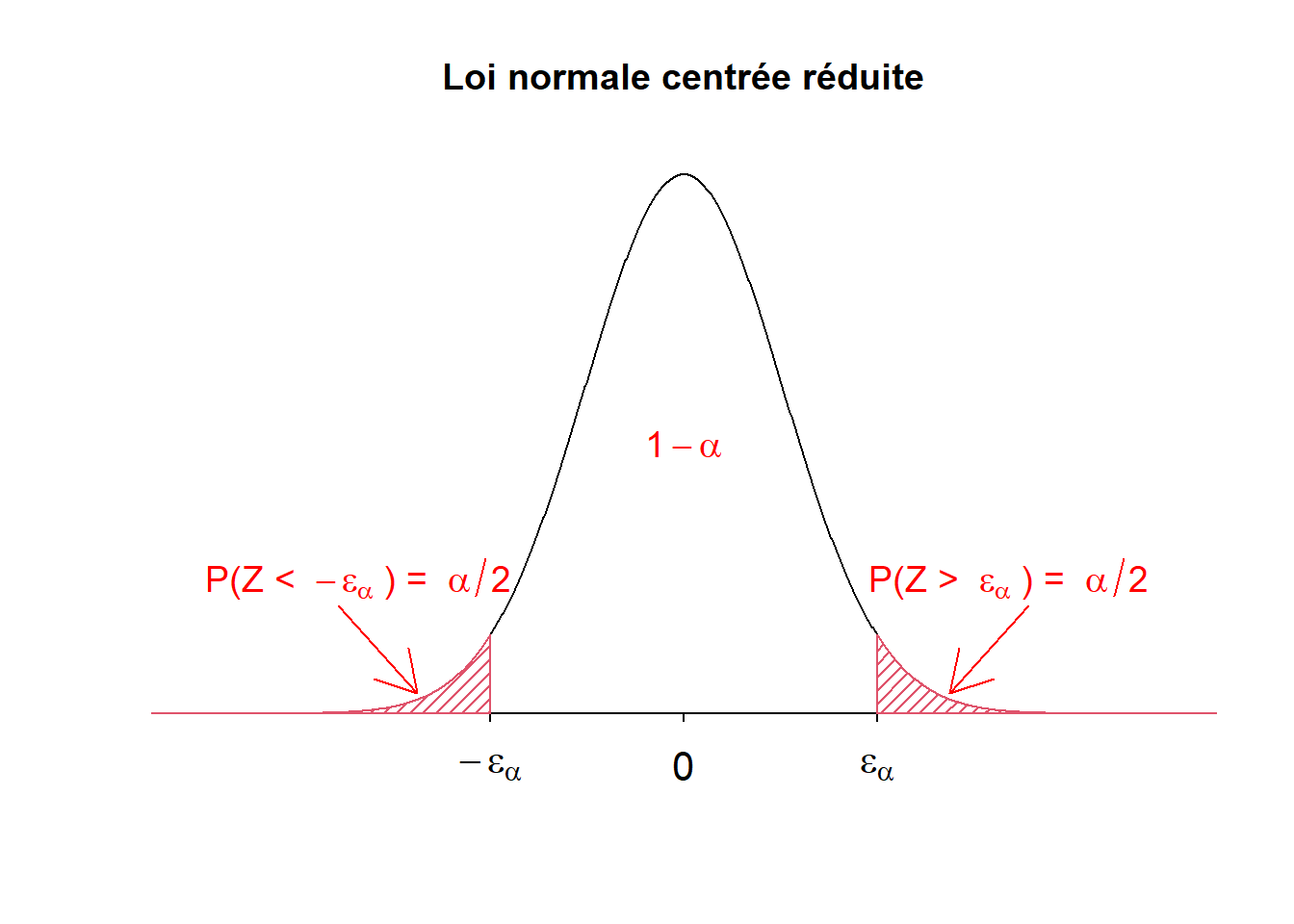
Contact
This document is a work by Emma Lafaurie (emma.lafaurie@inserm.fr) for the SBIM (Service de Biostatistique et Information Médicale) at Saint-Louis Hospital in Paris.
Based on the template of Yan Holtz.