Linear evolution
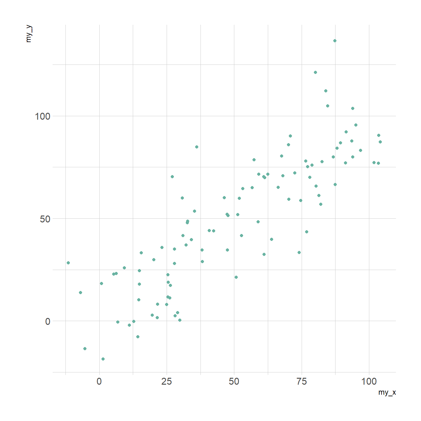
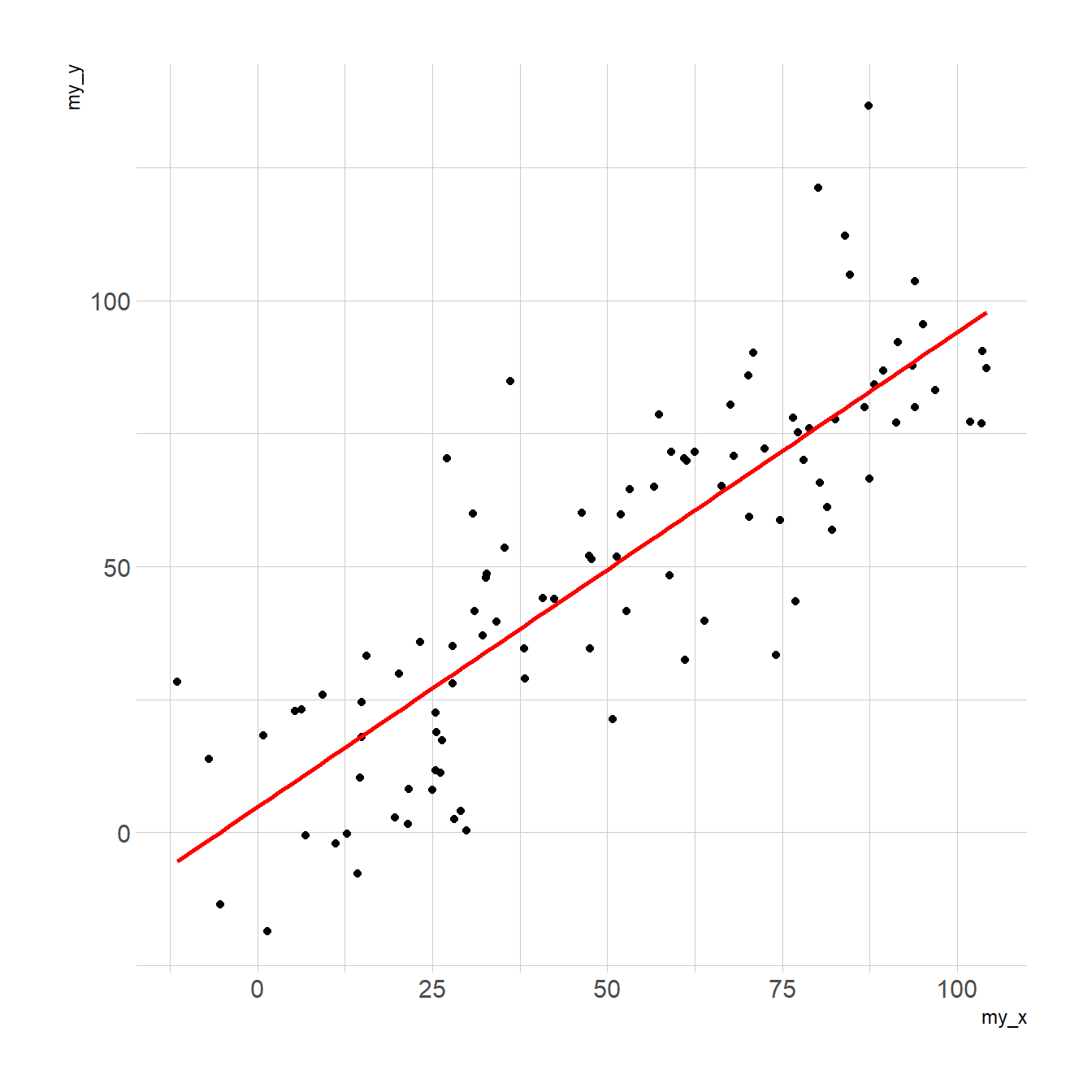
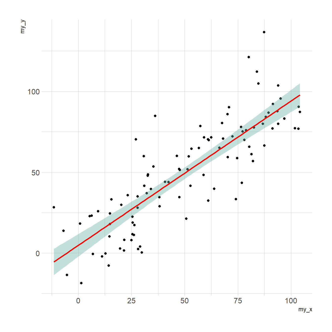
Adding a linear trend to a scatterplot helps the reader in seeing patterns. ggplot2 provides the geom_smooth() function that allows to add the linear trend and the confidence interval around it if needed (option se=TRUE).
Note:: the method argument allows to apply different smoothing method like glm, loess and more. See the doc for more.
# Libraries
library(ggplot2)
library(hrbrthemes)

# Create data
data <- data.frame(
  cond = rep(c("condition_1", "condition_2"), each=10),
  my_x = 1:100 + rnorm(100,sd=9),
  my_y = 1:100 + rnorm(100,sd=16)
)

# Basic scatter plot
p1 <- ggplot(data, aes(x=my_x, y=my_y)) +
  geom_point( color="#69b3a2") +
  theme_ipsum()

# with linear trend
p2 <- ggplot(data, aes(x=my_x, y=my_y)) +
  geom_point() +
  geom_smooth(method=lm , color="red", se=FALSE) +
  theme_ipsum()

# linear trend + confidence interval
p3 <- ggplot(data, aes(x=my_x, y=my_y)) +
  geom_point() +
  geom_smooth(method=lm , color="red", fill="#69b3a2", se=TRUE) +
  theme_ipsum()