Data
# Libraries
library(survminer)
library(survival)

# Reformate the data table with the variables we'll use
lung <- lung[,c("time","status","sex")]
lung format :
A data frame with 228 observations on the following 10 variables :
time Survival time in days
status Censoring status; 1=censored, 2=dead
Sex Patient sex; Male=1 Female=2
#Head of dataset
knitr::kable(head(lung,8), align = "l")| time | status | sex |
|---|---|---|
| 306 | 2 | 1 |
| 455 | 2 | 1 |
| 1010 | 1 | 1 |
| 210 | 2 | 1 |
| 883 | 2 | 1 |
| 1022 | 1 | 1 |
| 310 | 2 | 2 |
| 361 | 2 | 2 |
ggsurvplot function
ggsurvplot(
fit, A survfit object
data = NULL, Dataset used to fit survival curves
fun = NULL, An arbitrary function defining a transformation of the survival curve
color = NULL, Color to be used for the survival curves
palette = NULL, The color palette to be used
linetype = 1, Line types. Allowed values includes : i) “strata” for changing linetypes by strata (i.e. groups); ii) a numeric vector (e.g., c(1, 2)) or a character vector c(“solid”, “dashed”)
conf.int = FALSE, Logical value. If TRUE, plots confidence interval
pval = FALSE, Logical value, a numeric or a string. If logical and TRUE, the p-value is added on the plot. If numeric, than the computet p-value is substituted with the one passed with this parameter. If character, then the customized string appears on the plot
pval.coord = NULL, numeric vector, of length 2, specifying the x and y coordinates of the p-value
pval.method = FALSE, Whether to add a text with the test name used for calculating the pvalue
test.for.trend = FALSE, Logical value. If TRUE, returns the test for trend p-values
surv.median.line = "none", Character vector for drawing a horizontal/vertical line at median survival. Allowed values include one of c(“none”, “hv”, “h”, “v”). v: vertical, h:horizontal
risk.table = FALSE, TRUE or FALSE specifying whether to show or not the risk table or ‘absolute’, ‘percentage’, ‘nrisk_cumcensor’, ‘nrisk_cumevents’
risk.table.fontsize, Font size to be used for the risk table and the cumulative events table
cumevents = FALSE, Logical value specifying whether to show or not the table of the cumulative number of events
cumcensor = FALSE, Logical value specifying whether to show or not the table of the cumulative number of censoring
tables.height = 0.25, Numeric value (in [0 - 1]) specifying the general height of all tables under the main survival plot
group.by = NULL, A character vector containing the name of grouping variables
facet.by = NULL, A character vector containing the name of grouping variables to facet the survival curves into multiple panels
add.all = FALSE, Logical value. If TRUE, add the survival curve of pooled patients onto the main plot
combine = FALSE, Logical value. If TRUE, combine a list survfit objects on the same plot
break.time.by = NULL, numeric value controlling time axis breaks
ggtheme = theme_survminer(), ggplot2 theme name (see ggplot2 page)
tables.theme = ggtheme, ggplot2 theme name (see ggsurvtheme)
... )
Fitting survival curves
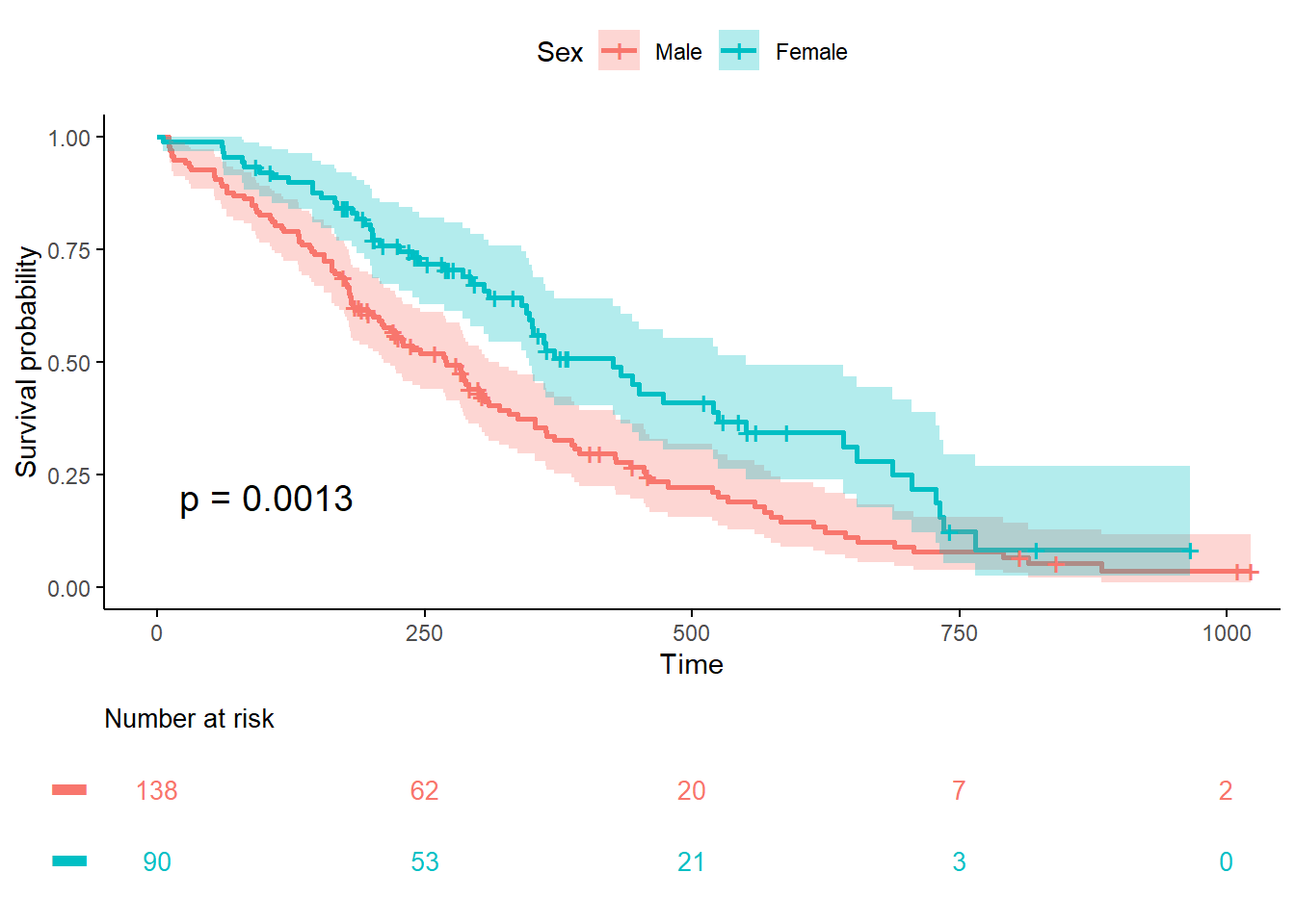
fit <- survfit(Surv(time, status) ~ sex, data = lung)Customized survival curves
plot.OS <-ggsurvplot(
  fit,
  data = lung,                      # Optionnal
  xlim=c(0, 1000),
  legend="top",
  legend.labs = c("Male", "Female"),# Change legend labels
  legend.title ="Sex",
  size = 1,                         # Change line size
  break.time.by = 250,              # Break X axis in time intervals by 200.
  # palette = c("#E7B800", "#2E9FDF"),# custom color palettes
  conf.int = TRUE,                  # Add confidence interval
  pval = TRUE,                      # Add p-value
  risk.table = TRUE,                # Add risk table
  risk.table.title = "Number at risk",
  risk.table.col = "strata",        # Risk table color by groups
  risk.table.fontsize = 3.5,
  risk.table.height = 0.25,         # Useful to change when you have multiple groups
  risk.table.y.text = FALSE,        # Show bars instead of names in text annotations
  ggtheme = theme_classic(),        # Change ggplot2 theme (see ggplot2 page)
  tables.theme = theme_cleantable()
)
#  To customize risk table
plot.OS$table <- plot.OS$table + theme(plot.title = element_text(size = 10, color = "black", face = "plain"))
plot.OS