In medical research, a waterfall plot is a special type of bar chart which allows you to see, at a glance, such details as the response of a number of patients to treatment, the growth of tumors in cancer patients, or the effectiveness of drugs given various criteria.
These plots look like ordered bar graphs, where some bars may pass into negative y.
Data
We load the packages we will use :
#libraries
library(tidyverse)
library(dplyr)
library(knitr)
library(ggplot2)
We create an example dataset :
Merkel <- data.frame(
  id=c(1:56),
  type = sample((rep(c("laMCC", "metMCC"), times =28))),
  response = c(30, sort(runif(n=53,min=-10,max=19), decreasing=TRUE),-25,-31),
  dose= sample(rep(c(80, 150), 28)))

# Let's assign Best Overall Response (BOR)
Merkel$BOR= (c("PD", rep(c("SD"), times =54),"PR"))
Merkel format :
A data frame with 56 observations on the following 5 variables :
id ID of every subject
type MCC type
response Treatment response
dose Treatment dose
BOR Best Overall Response
#Head of dataset
knitr::kable(head(Merkel,8), align = "l")| id | type | response | dose | BOR |
|---|---|---|---|---|
| 1 | metMCC | 30.00000 | 80 | PD |
| 2 | metMCC | 18.64924 | 150 | SD |
| 3 | laMCC | 18.18168 | 80 | SD |
| 4 | laMCC | 17.51477 | 80 | SD |
| 5 | metMCC | 16.57039 | 150 | SD |
| 6 | metMCC | 15.32190 | 80 | SD |
| 7 | metMCC | 14.14190 | 150 | SD |
| 8 | metMCC | 13.48021 | 150 | SD |
barplot function
ESKE on met la description du barplot ou on fait une page barplot??
Basic waterfall plot
barplot(Merkel$response,
        col="coral",
        border="coral",
        space=0.5, ylim=c(-50,50),
        main = "Waterfall plot for Target Lesion Tumor Size",
        ylab="Percentage change from baseline",
        cex.axis=1, cex.lab=1)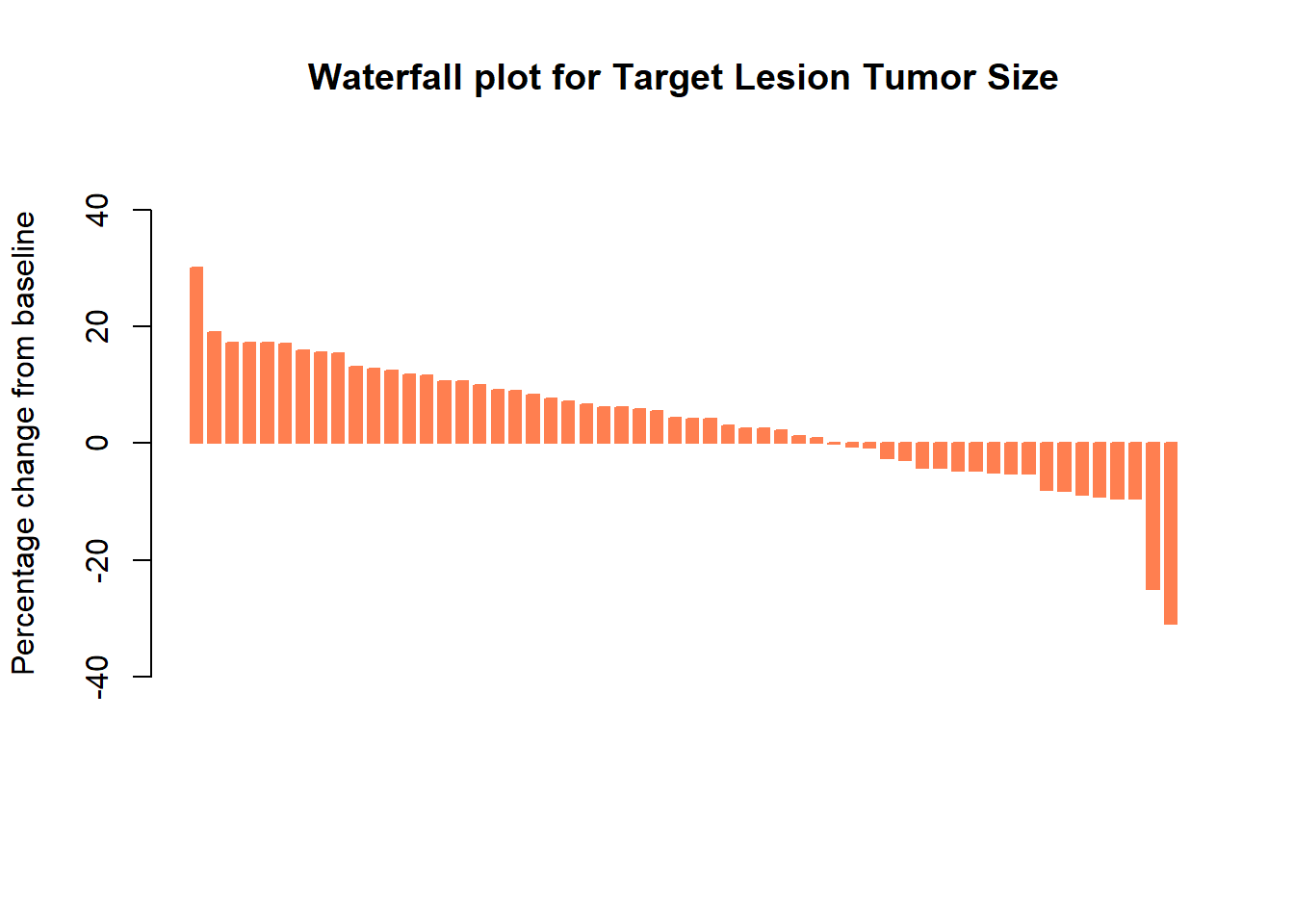
Add color by dose
col <- ifelse(Merkel$dose == 80,
              "cornflowerblue", # if dose = 80 mg
              "salmon") # if dose != 80 mg

barplot(Merkel$response,
        col=col,
        border=col,
        space=0.5,
        ylim=c(-50,50),
        main = "Waterfall plot for Target Lesion Tumor Size",
        ylab="Percentage change from baseline",
        cex.axis=1,
        legend.text= c( "80 mg", "150 mg"),
        args.legend=list(title="Treatment Dose", fill=c("cornflowerblue", "salmon"), border=NA, cex=1))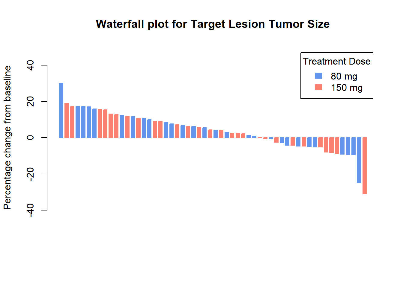
Add color by Best Overall Response
col <- ifelse(Merkel$BOR == "CR",
              "#00A087B2",
              ifelse(Merkel$BOR == "PR",
                     "#4DBBD5B2",
                     ifelse(Merkel$BOR == "PD",
                            "#DC0000B2",
                            ifelse(Merkel$BOR == "SD",
                                   "#3C5488B2",
                                   "")
                            )))


barplot(Merkel$response,
        col=col,
        border=col,
        space=0.5,
        ylim=c(-50,50),
        main = "Waterfall plot for Target Lesion Tumor Size",
        ylab="Percentage change from baseline",
        cex.axis=.8,
        legend.text= c( "CR: Complete Response", "PR: Partial Response", "SD: Stable Disease", "PD: Progressive Disease"),
        args.legend=list(title="Best Overall Response", fill=c("#00A087B2","#4DBBD5B2",  "#DC0000B2", "#3C5488B2"), border=NA, cex=.9))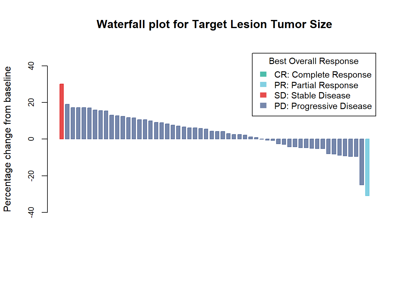
Add horizontal lines at 20% and -30%
barplot(Merkel$response,
        col=col,
        border=col,
        space=0.5,
        ylim=c(-50,50),
        main = "Waterfall plot for Target Lesion Tumor Size",
        ylab="Percentage change from baseline",
        cex.axis=1,
        legend.text= c( "CR: Complete Response", "PR: Partial Response", "SD: Stable Disease", "PD: Progressive Disease"),
        args.legend=list(title="Best Overall Response", fill=c("#00A087B2","#4DBBD5B2",  "#DC0000B2", "#3C5488B2"), border=NA, cex=.9))

abline(h=20, lty=5, lwd=2) #lty : line type ; lwd : line width
abline(h=-30, lty=5, lwd=2)

barplot(Merkel$response,
        col=col,
        border=col,
        space=0.5,
        ylim=c(-50,50),
        main = "Waterfall plot for Target Lesion Tumor Size",
        ylab="Percentage change from baseline",
        cex.axis=1,
        legend.text= c( "CR: Complete Response", "PR: Partial Response", "SD: Stable Disease", "PD: Progressive Disease"),
        args.legend=list(title="Best Overall Response", fill=c("#00A087B2","#4DBBD5B2",  "#DC0000B2", "#3C5488B2"), border=NA, cex=.9),
        add=TRUE) # Add = TRUE to draw line behind bars and legend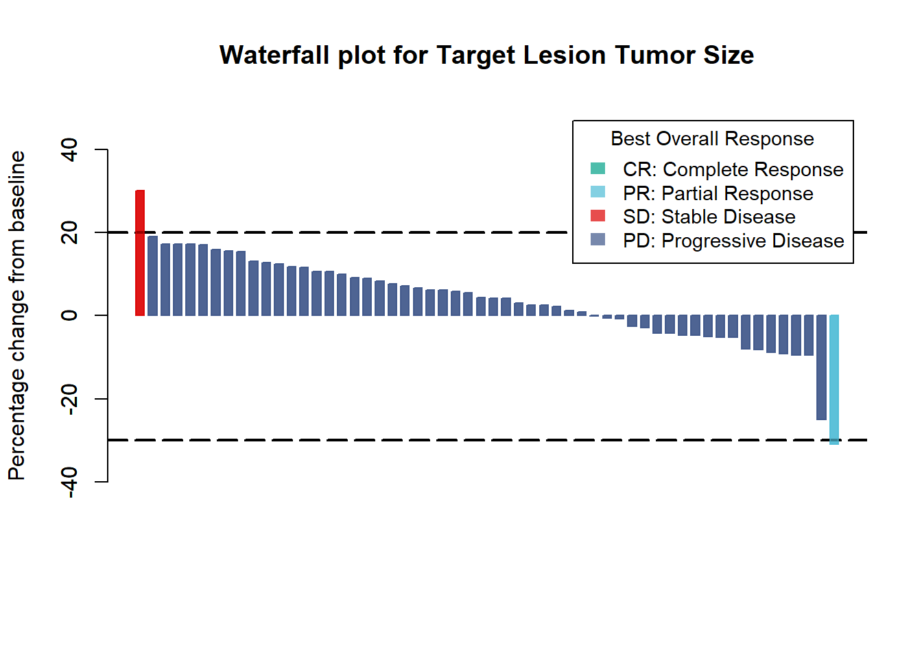
Contact
This document is a work by Emma Lafaurie (emma.lafaurie@inserm.fr) for the SBIM (Service de Biostatistique et Information Médicale) at Saint-Louis Hospital in Paris.
Based on the template of Yan Holtz.