A ROC curve (receiver operating characteristic curve) is a graph showing the performance of a classification model at all classification thresholds.
Data
We load the packages we will use :
# libraries
library(pROC)
library(dplyr)
library(ggplot2)
library(OptimalCutpoints)
We use the data frame called aSAH in pROC library :
data(aSAH)
aSAH1 <- aSAH[,c(2,6)]
rocobj <- roc(aSAH1$outcome, aSAH1$s100b, ci=T)
aSAH format :
A data frame containing 113 observations with 2 variables we will use :
outcome MCC type
s100b Concentration of S100B
#Head of dataset
knitr::kable(head(aSAH1,8), align = "l", row.names = FALSE)| outcome | s100b |
|---|---|
| Good | 0.13 |
| Good | 0.14 |
| Good | 0.10 |
| Good | 0.04 |
| Poor | 0.13 |
| Poor | 0.10 |
| Good | 0.47 |
| Poor | 0.16 |
ggroc function
ggroc(
data, a roc object from the roc function, or a list of roc objects
aes, the name of the aesthetics for geom_line to map to the different ROC curves supplied. Use “group” if you want the curves to appear with the same aestetic, for instance if you are faceting instead
legacy.axes, a logical indicating if the specificity axis (x axis) must be plotted as as decreasing “specificity” (FALSE, the default) or increasing “1 - specificity” (TRUE) as in most legacy software
... )
Basic ROC curve
# roc basic
ggroc(rocobj) +
  theme_minimal() #ggplot2 theme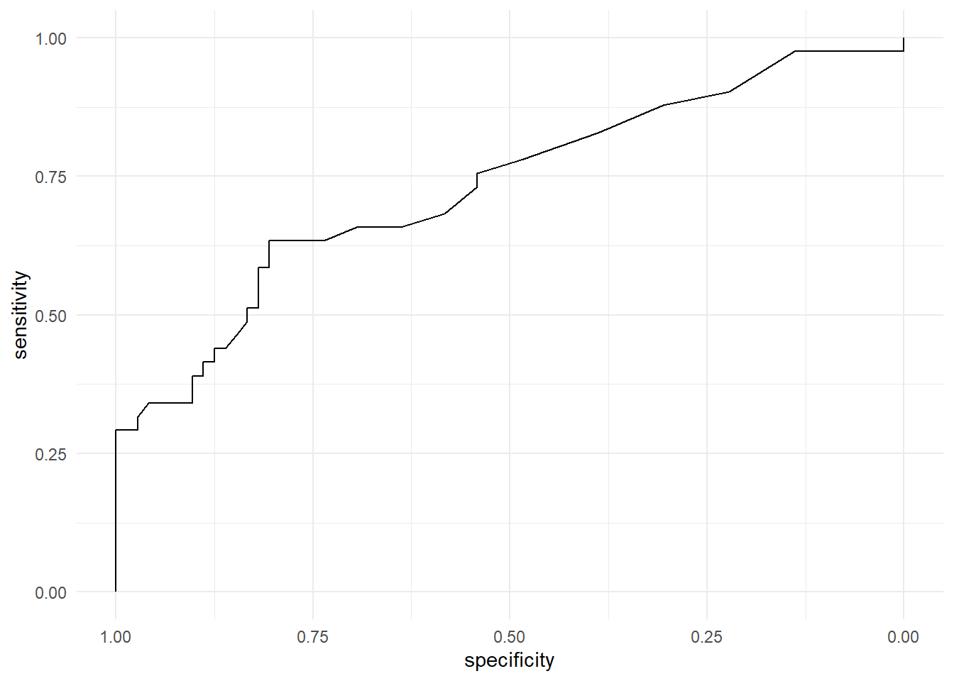
Customized ROC curve
# add options
# confidence interval of the sensitivity
ci.se.rocobj <- ci(rocobj, of="se", boot.n=2000)
dat.ci <- data.frame(x = as.numeric(rownames(ci.se.rocobj)),
                     lower = ci.se.rocobj[, 1],
                     upper = ci.se.rocobj[, 3])

# selection of a threshold
dat.seuil=coords(rocobj, "best", best.method=c("youden"), ret=c("threshold", "sensitivity", "specificity"))


# roc with options: CI, selected threshold, title with AUC and confidence interval
ggroc(rocobj) +
  theme_minimal() +   #ggplot theme
  geom_abline(slope=1, intercept = 1, linetype = "dashed", alpha=0.7, color = "grey") +   # add abline and custom
  coord_equal() +   #  ensures the units are equally scaled on the x-axis and on the y-axis
  geom_ribbon(data = dat.ci, aes(x = x, ymin = lower, ymax = upper), fill = "grey", alpha= 0.2) +  # generate confidence interval of sensibility
  ggtitle(paste0("AUC=", round(rocobj$auc, 2), ", ", capture.output(rocobj$ci))) +   # plot title
  geom_point(data = tibble(se=dat.seuil$sensitivity, sp=dat.seuil$specificity), mapping = aes(x=sp, y=se), colour = "red") +
  annotate("text", x=dat.seuil$specificity-0.16, y=dat.seuil$sensitivity-0.05,
           label= paste0(round(dat.seuil$threshold, 2), " (", round(dat.seuil$specificity, 2), ",", round(dat.seuil$sensitivity, 2), ")"))   # add anotations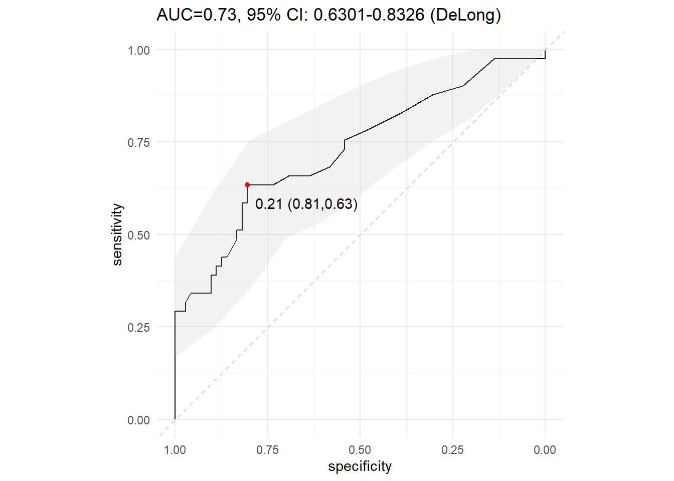
Contact
This document is a work by Emma Lafaurie (emma.lafaurie@inserm.fr) for the SBIM (Service de Biostatistique et Information Médicale) at Saint-Louis Hospital in Paris.
Based on the template of Yan Holtz.